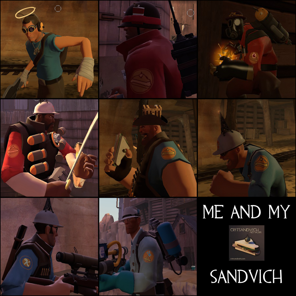
VoltySquirrel wrote:A simple character reskin that replaces the class logo on the upper arm with a Sandvich. A little subtle, but it's a nice effect.
This one is would take a little bit more work, but you ever heard of Sandwich-in-a-can? Well, I'm sure that a having some Critsandvich-in-a-can would put out some minicrits (hint: Crit-a-Cola reskin).
That's all I got atm.
EDIT: Oh, and, although it might look cheap, but any weapon would look nicer with a CSn sticker stuck on there.
doppelganger wrote:a sandvich in place of the demos' smiley face.
Techercizer wrote:You...would not believe how hard it is to get a Sandvich image that works at the resolution these VTFs are scaled to...
Vintage Meat Boy wrote:Techercizer wrote:You...would not believe how hard it is to get a Sandvich image that works at the resolution these VTFs are scaled to...
You actually don't have to follow the resolutions. My vending machine skin in Counter-Strike: Source is 1024x1024, double the normal resolution, and it displays normally.
Sirnak wrote:This look really really good Tech. o.o
What surprises me the most is how so little admins commented in this topic (if any?). It's a great project for CSn and it seems to be done with skill as well. o.o
Please don't give up. I'm sure you'll have dozens of fans around here when it'll all be finished.
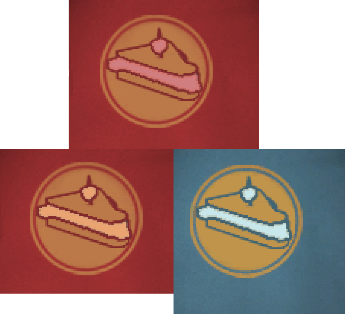
Techercizer wrote:I'm kind of bummed that none of the Sandvich parts are team-coloured like the logos they're replacing, but I couldn't find any way to make that colour scheme look good.
Vintage Meat Boy wrote:Techercizer wrote:I'm kind of bummed that none of the Sandvich parts are team-coloured like the logos they're replacing, but I couldn't find any way to make that colour scheme look good.
Something like this?
http://i21.servimg.com/u/f21/15/71/50/80/12977910.png
Eh, something I whipped up in like five minutes in Photoshop.
Techercizer wrote:Vintage Meat Boy wrote:Techercizer wrote:I'm kind of bummed that none of the Sandvich parts are team-coloured like the logos they're replacing, but I couldn't find any way to make that colour scheme look good.
Something like this?
http://i21.servimg.com/u/f21/15/71/50/80/12977910.png
Eh, something I whipped up in like five minutes in Photoshop.
Thing is, it's an emblem, so ideally it needs to be composed only of two colours, one of which is the background. Like this:
http://wiki.teamfortress.com/w/images/0 ... ge_RED.png
I'm kind of cheating that design ethic at the moment with outlines and a 3rd, white-ish colour, so I'm not 100% in-style.
doppelganger wrote:bottom left
Sirnak wrote:What surprises me the most is how so little admins commented in this topic (if any?).
Benny Hill wrote:Wow, this is neat. I sometimes have trouble going through all the forum posts so it takes a while for me to notice . Some really neat stuff going on here
The 12th Doctor wrote:Quick note: the skins do indeed work on Slaybox 1. Only one that I've tested so far. Also, they look great!
Jake wrote:Philosiraptor was asked to step in with the price checking debate.
VoltySquirrel wrote:It's "discussions" like this one here that make me never post in the Admin Lounge.
AuronV3 wrote:Keep up the good work tech.
Users browsing this forum: No registered users and 1 guest